Dead Center Records
A brand and storefront for signed, collectible vinyl: chaos on the outside, treasure within.
00

.work summary
Dead Center Records is a brand and online storefront I'm building for Jamesly Clark, the sole curator behind a collection of well over a thousand signed records. Jamesly's method is his own kind of gamble: he buys most of them straight from the artist's own store, signed, before the album is even released, betting on what each one will come to mean. The result is a hoard with real range and real risk behind it, and a store whose whole premise is trust: these records are signed, rare, and collectible, and provenance is as much the product as the vinyl itself.
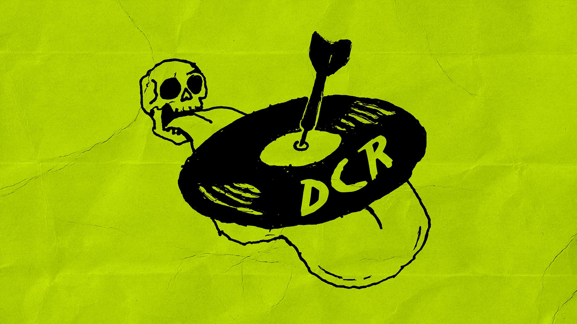
The identity leans all the way into a chaotic, hand-made poster aesthetic: bold colors, thick black line illustration, warped type, and a scanned, photocopied imperfection, like an underground record-fair or rave flyer. That's a deliberate portrait of Jamesly himself, who is scattered and a little wild but beautiful and charming with it. The trick is the tension: that loud flyer energy is the wrapper, while the product, each signed record, sits clean and premium behind it. I'm designing the whole thing end to end, from the identity and storefront to the packaging and the motion that ties it together. At the center of it is a skull with an oversized tongue rolling out in perspective, a vinyl balanced on the tongue and a dart pinned through its dead center: the name made literal, and the sticker that'll go in every package.
.impact
Founding designer building the full brand identity and online storefront end to end
Translating one collector's chaotic, charming personality into a coherent visual world
Balancing a raw DIY-flyer facade against a clean, premium product experience
Designing the trust layer that signed vinyl depends on: certificate of authenticity, provenance, and an authentication story
Building a motion language that keeps the wrapper loud and the records still
year
2026
contribution
Brand identity, art direction, illustration, web & e-commerce design, packaging, motion design
credits
Curator & Founder: Jamesly Clarke. Brand & Design: Brandon Carrillo. Illustration: First Last.
01

02

03
04

05

06